CrediYork is a financial tracking software designed to help the management of Panadería Nueva York credits and funds distributed to employees. The tool provides an intuitive and clear interface, allowing administrators to easily oversee company finances and lending activities, ensuring a more efficient and streamlined accounting process.
PROJECT DETAILS
The client
Panadería Nueva York is a well-known bakery in Barranquilla, Colombia, offering a variety of fresh bread and pastries. It is appreciated for its quality products and customer service, often participating in community events and celebrations. The bakery is also committed to its employees, providing a credit and fund system to support their financial well-being
The problem
The previous version of the financial tracking software was difficult to use and slowed down task completion due to an overwhelming number of unorganized buttons and a lack of clear information hierarchy. The technical language was also confusing and the interface was cluttered with unnecessary elements.
DESIGN PROCESS
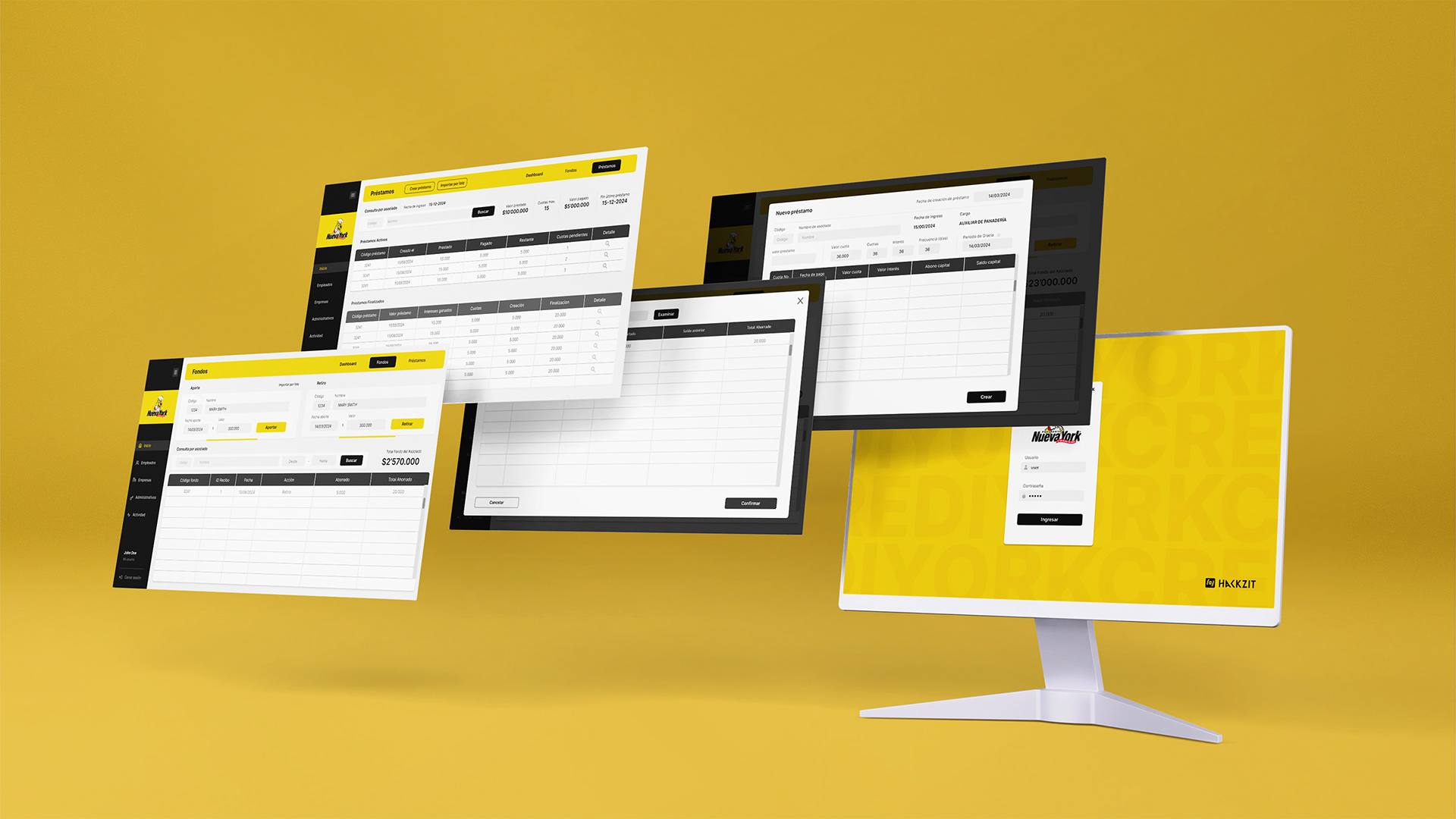
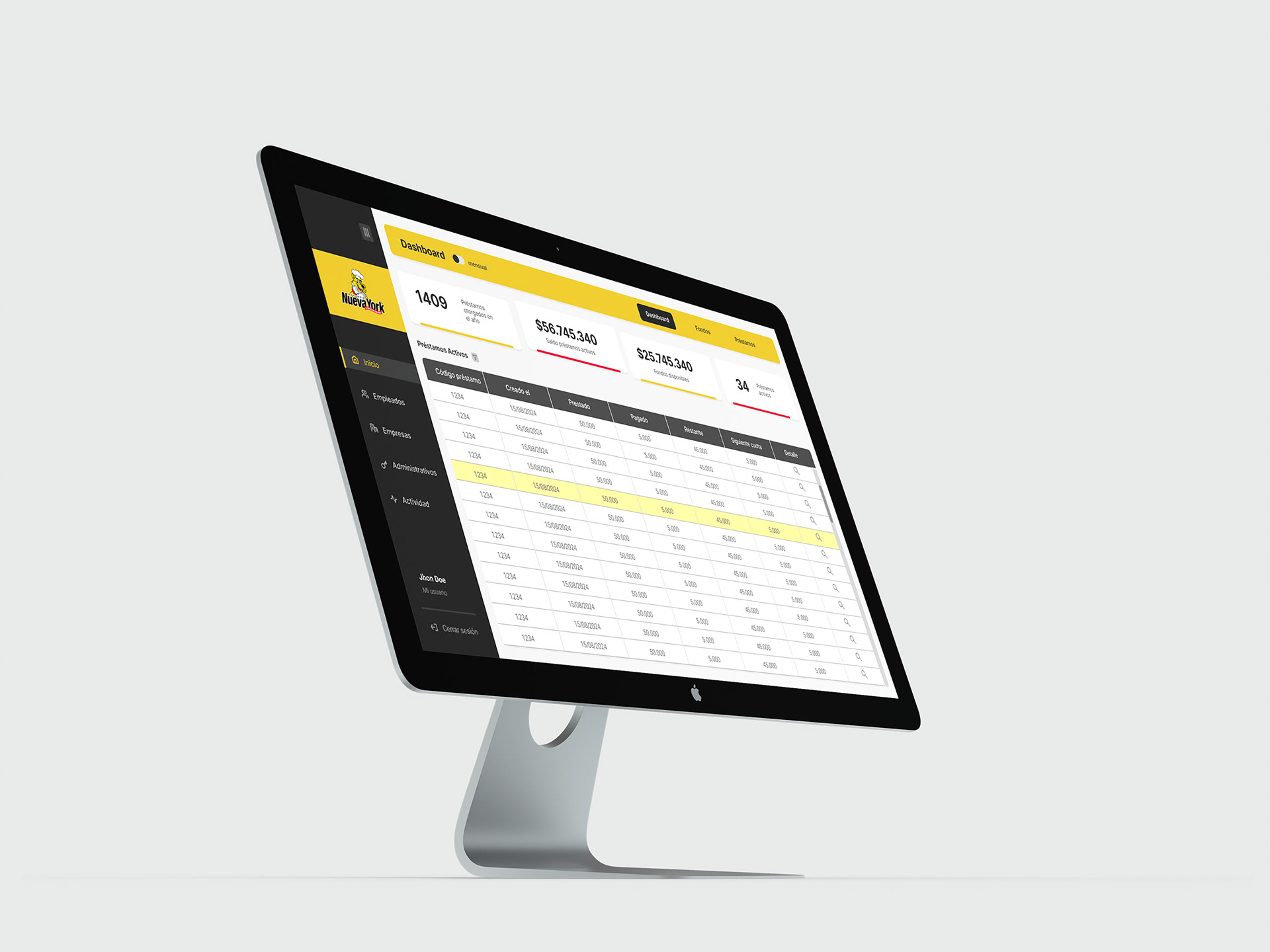
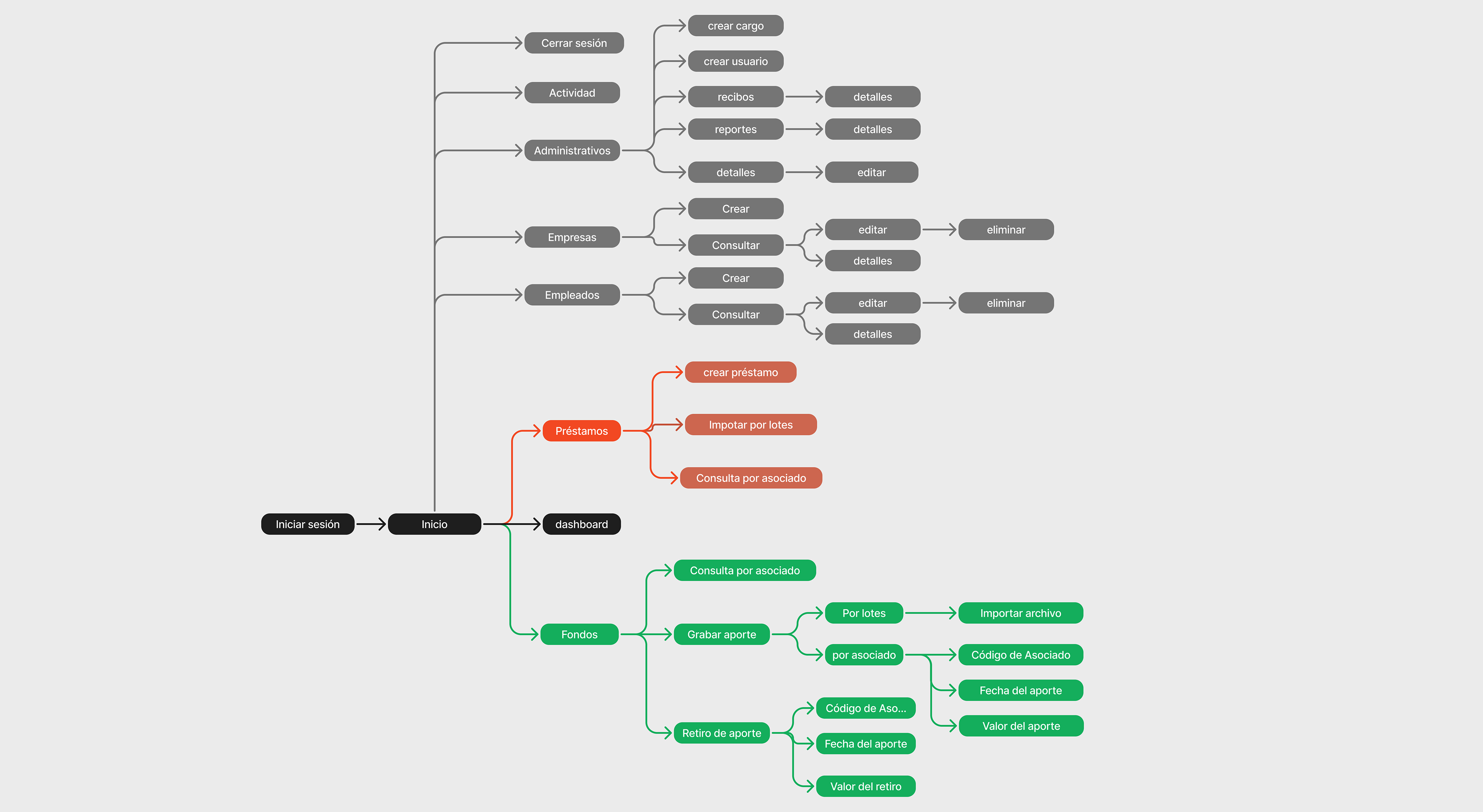
Simplifying Information Architecture (IA)
The information was organized around primary tasks, such as fund management and credit operations, while secondary tasks, like administrative functions, were grouped separately for easier access
Wireframing
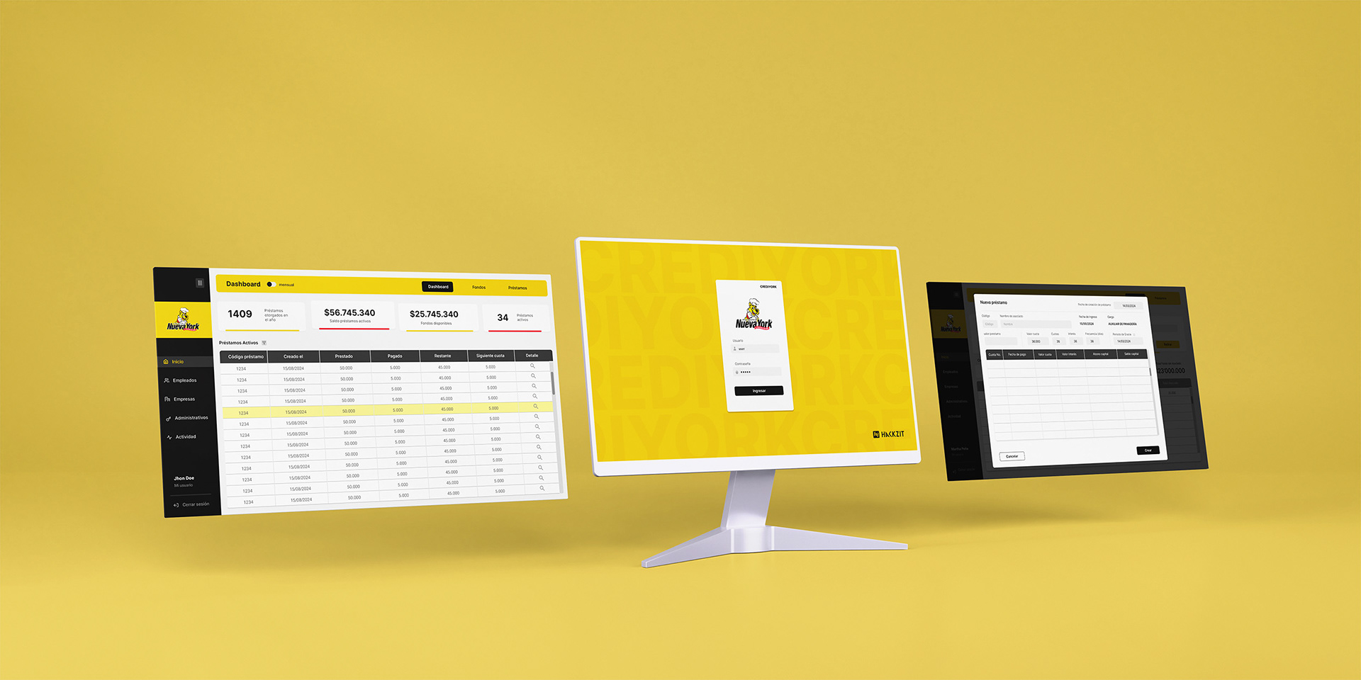
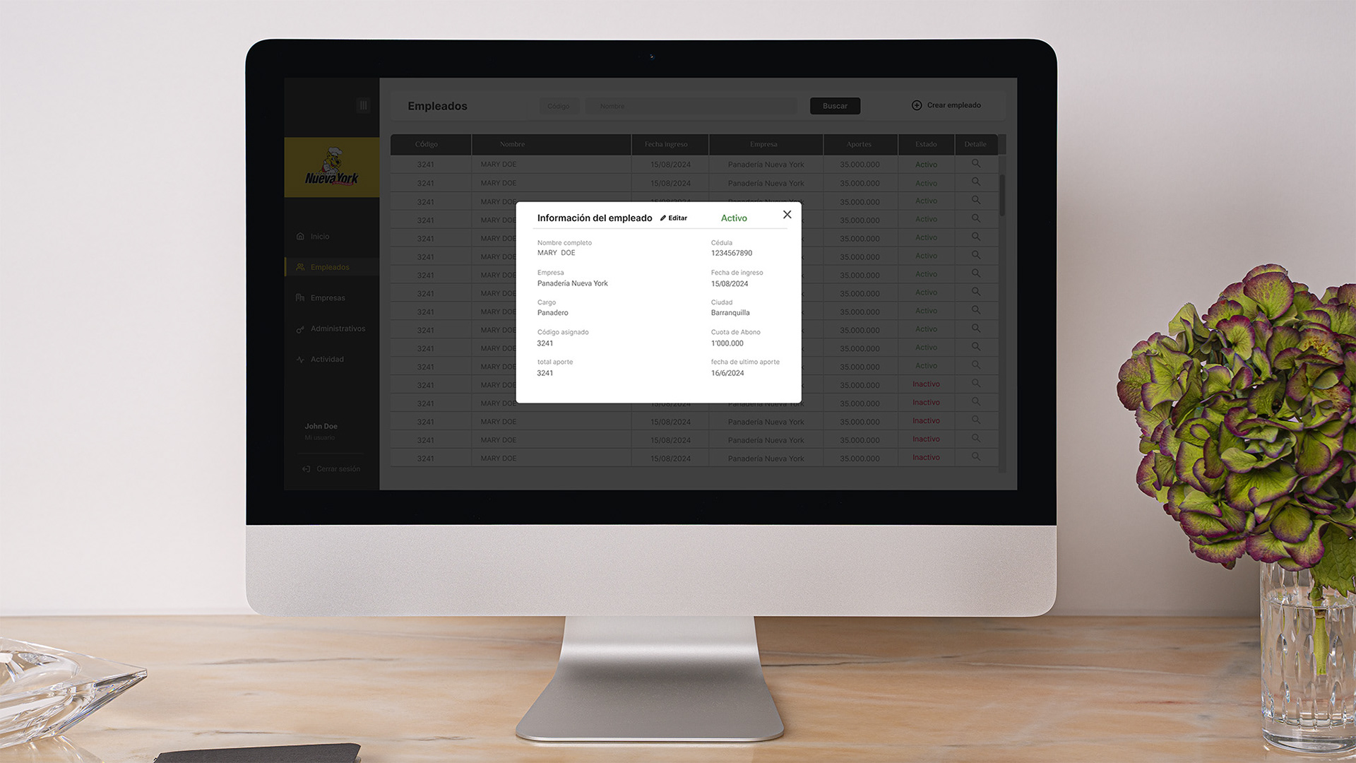
Primary tasks were organized in a navigation bar, with a dashboard providing quick access to essential data. A secondary panel on the left was added for less frequent actions, such as administrative tasks and company overviews, allowing users to focus on the main content in the center, enhancing usability.
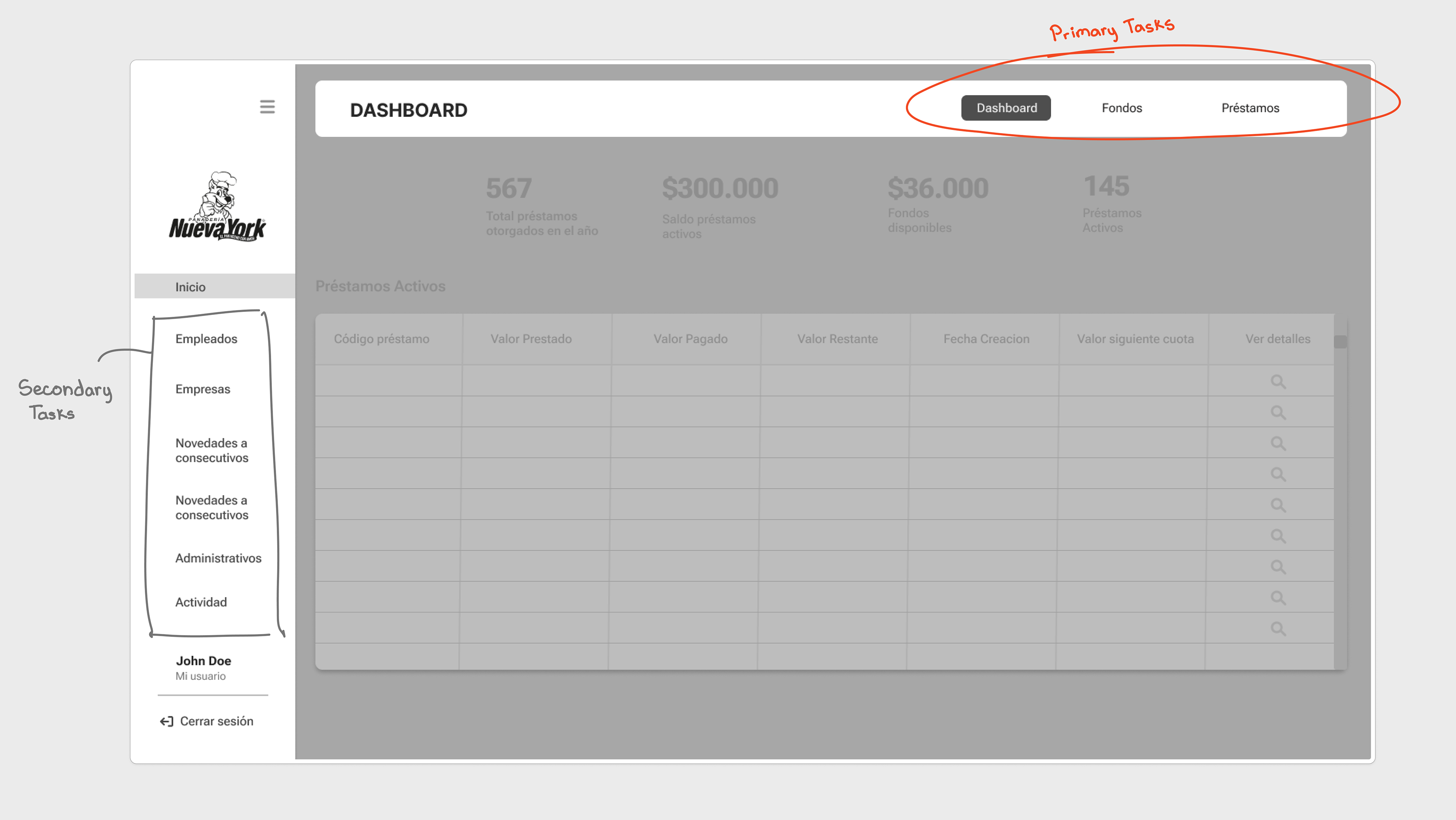
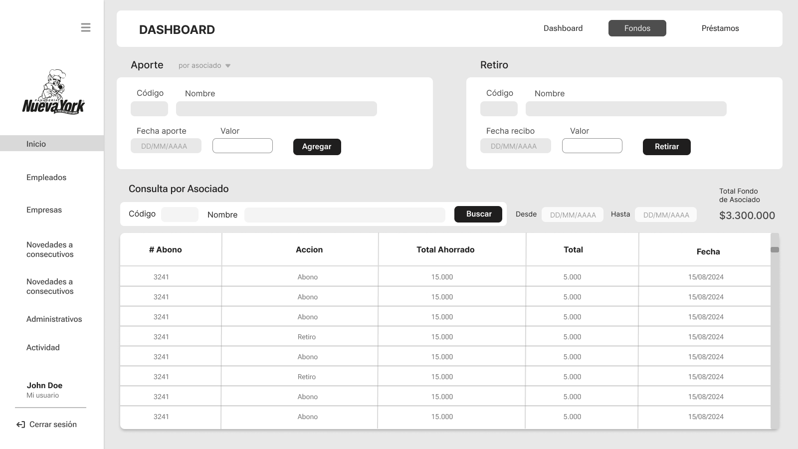
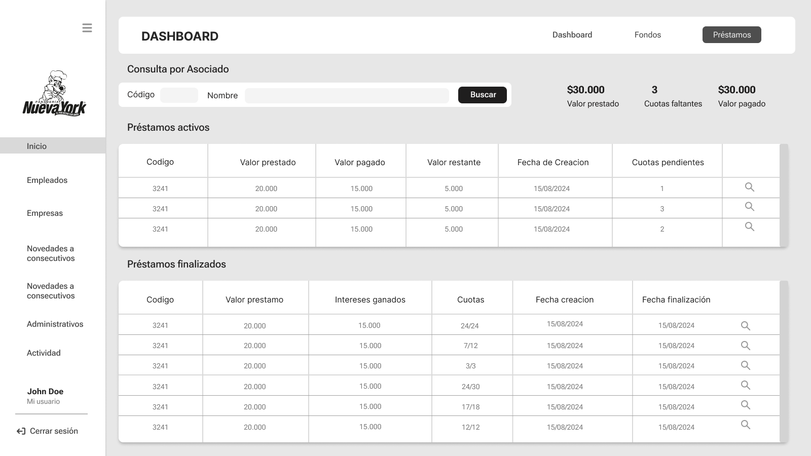
Each primary task (funds and credits) was structured with its related actions and views consolidated on a single page for easy access. Autocomplete search filters were introduced to help users find information more efficiently, retrieving relevant data with a single click. Also, Technical terms were replaced with simpler, user-friendly language to enhance comprehension.
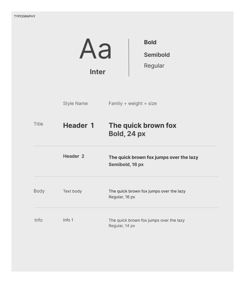
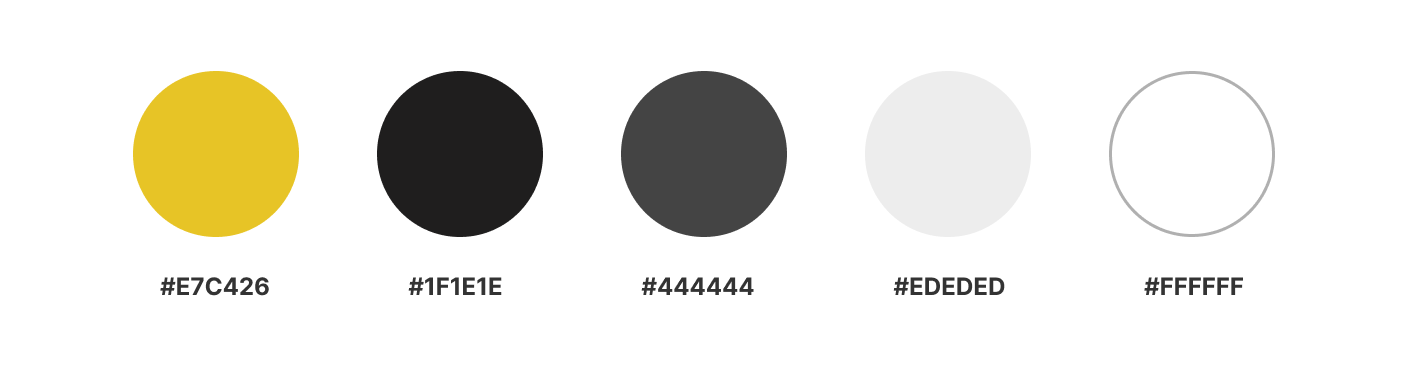
The color scheme was aligned with the company's brand identity, ensuring consistency across the interface, while Inter was chosen as the primary typography to enhance readability. Its clean and modern design helped maintain a professional yet user-friendly look, balancing aesthetic appeal with functionality.
After presenting the wireframe prototype, feedback mainly centered on additional features stakeholders wanted to integrate, along with the removal of unnecessary information. The improved organization and simplification were appreciated, as they enabled users to navigate the system over 50% more efficiently.
What I've learned
Through collaboration with engineers, I gained a clear understanding of the technical limitations of the project, which helped me make informed design decisions. I also learned the importance of staying organized, ensuring that all variables and project components were properly structured to maintain efficiency and clarity throughout the design process.
Outcomes
- The redesign greatly simplified task navigation and reduced user confusion.
- Introducing a clear hierarchy of tasks and a more streamlined interface led to a 50% faster task completion and a more user-friendly experience.
- Collaborating closely with engineers and stakeholders helped ensure that the design was not only visually appealing but also technically feasible and optimized for performance.